Margaret Kilgallen – “That’s Where The Beauty Is” @ Bonnefanten Museum « Arrested Motion
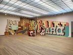
Following showings at the Aspen Art Museum and MOCA Cleveland, a retrospective of Margaret Kilgallen’s work entitled That’s Where The Beauty Is concluded shortly before Christmas after a seven month run at the Bonnefanten Museum in Maastricht. The exhibition presented a comprehensive survey of the work of the artist who has become closely associated with San Francisco’s Mission District.
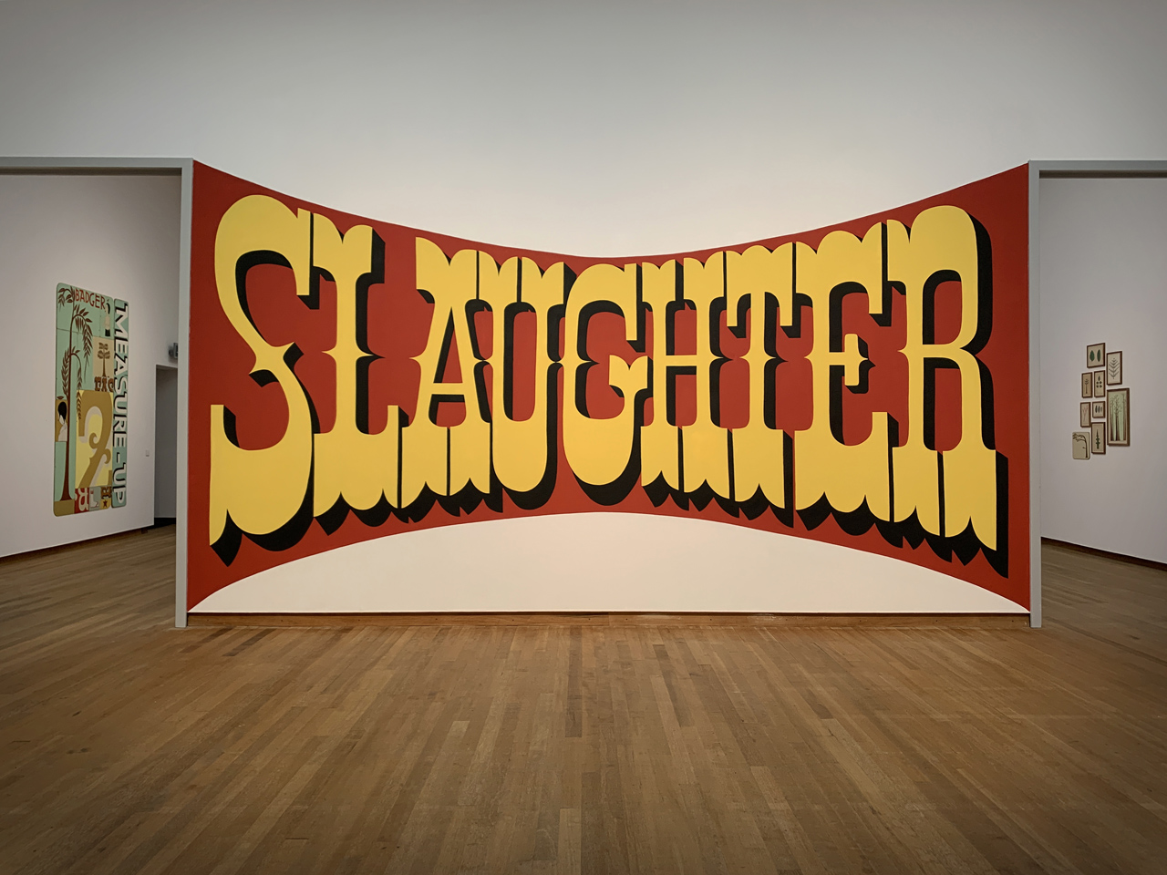
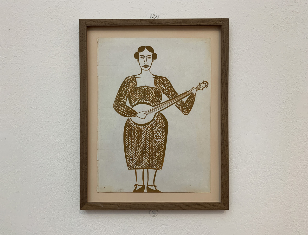
Visitors to the museum are first met by Jeff Canham and Signpainters & Co’s re-creation of the Slaughter mural which Kilgallen painted with her husband Barry McGee at San Francisco’s Gallery 16 in 1997. Her enigmatic use of language, rendered in vernacular typography, may in this instance appear to some to imply destruction or violence. But the name instead refers to Matokie Slaughter, a claw hammer banjo player who was one of her greatest inspirations and from whom her most commonly used tag – Meta – was derived. In the same room hangs an imagined portrait of the Appalachian musician, who takes on an almost mythical presence within Kilgallen’s œuvre.
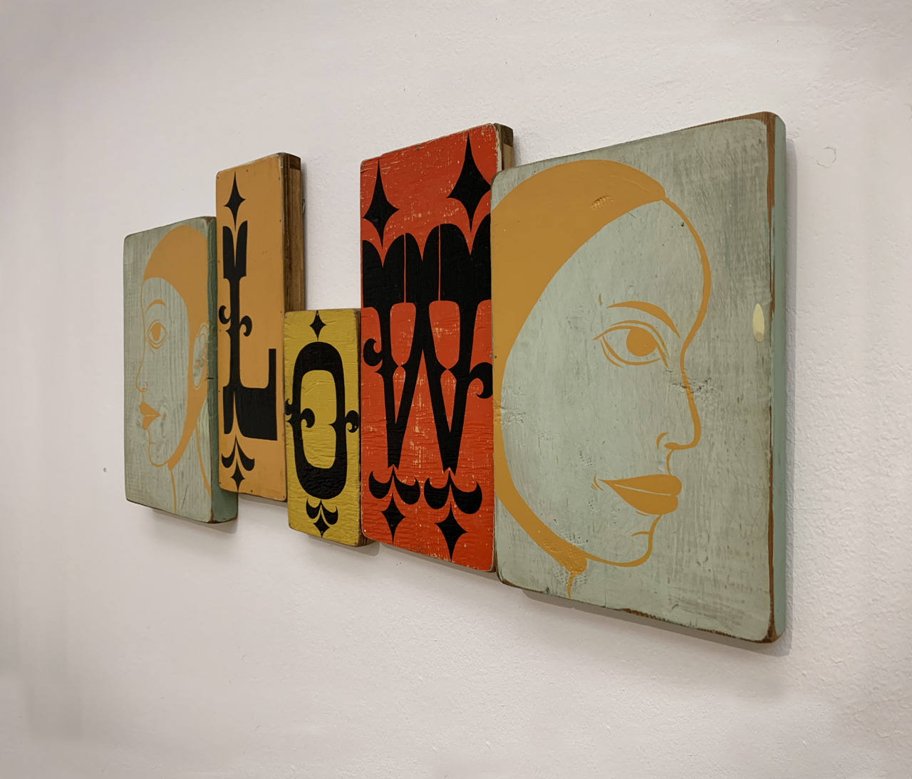
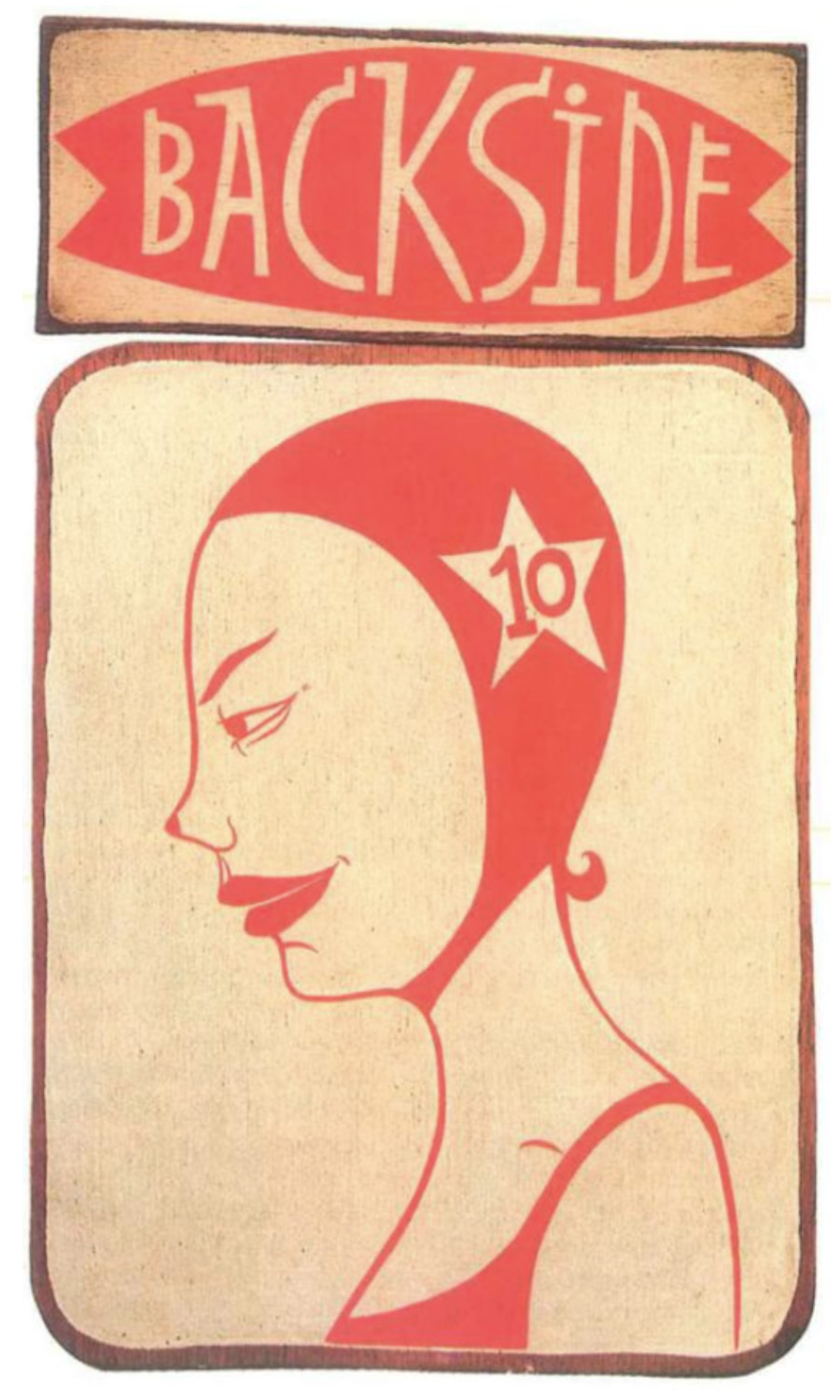
Kilgallen’s work undoubtedly owes something to painters such as Joan Brown, Barbara Stauffacher Solomon and Las Mujeres Muralistas. But her most profound influences were far more tangential and were made up of a cast of women that, in her own words, “do small things but somehow hit me in my heart”. Elsewhere she stated: “I like to change the emphasis on what’s important when looking at women”. These everyday but exceptional women feature throughout the exhibition: either side of the word ‘Low’ sit twin portraits of Fanny Durack who, wearing a woollen swimsuit, was the first women to win an Olympic swimming gold medal; Algia Mae Hinton was a Piedmont blues singer, guitarist and buck dancer who supported herself and her seven children with her music; a portrait of surf pioneer Linda Benson is situated below the word ‘Backside which continues her use of gnomic words and, in this instance, refers to her trademark board-riding style.
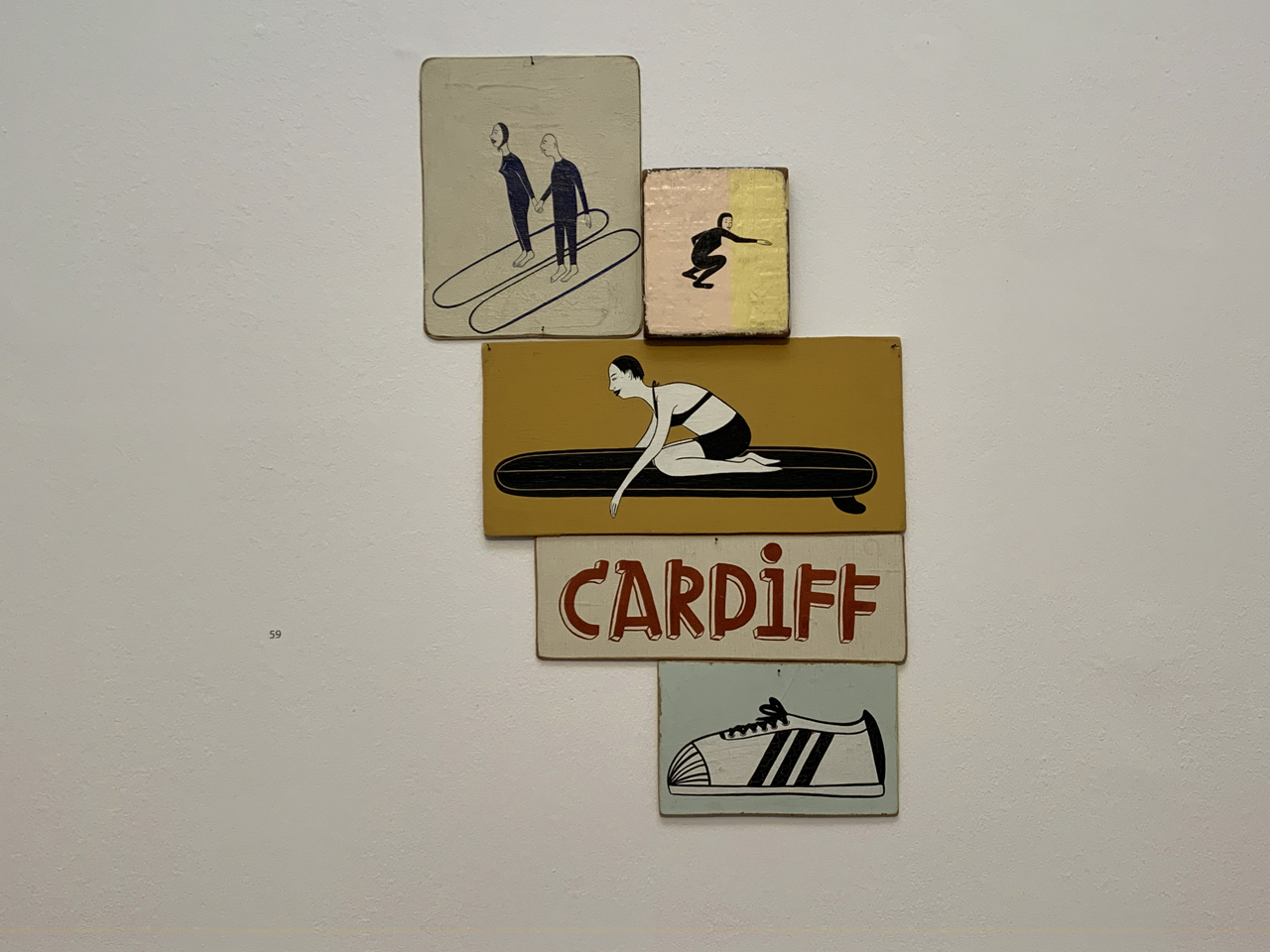
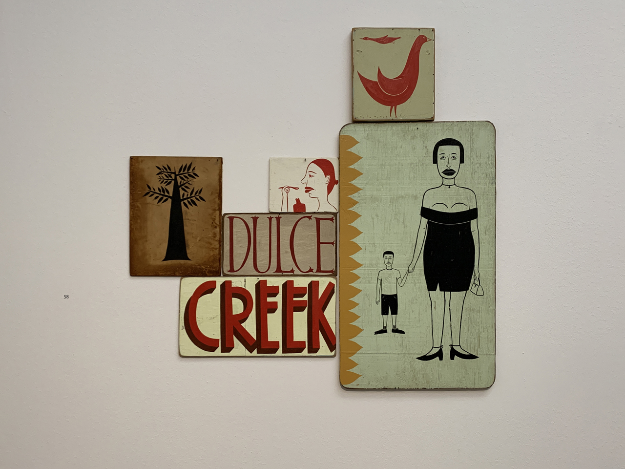
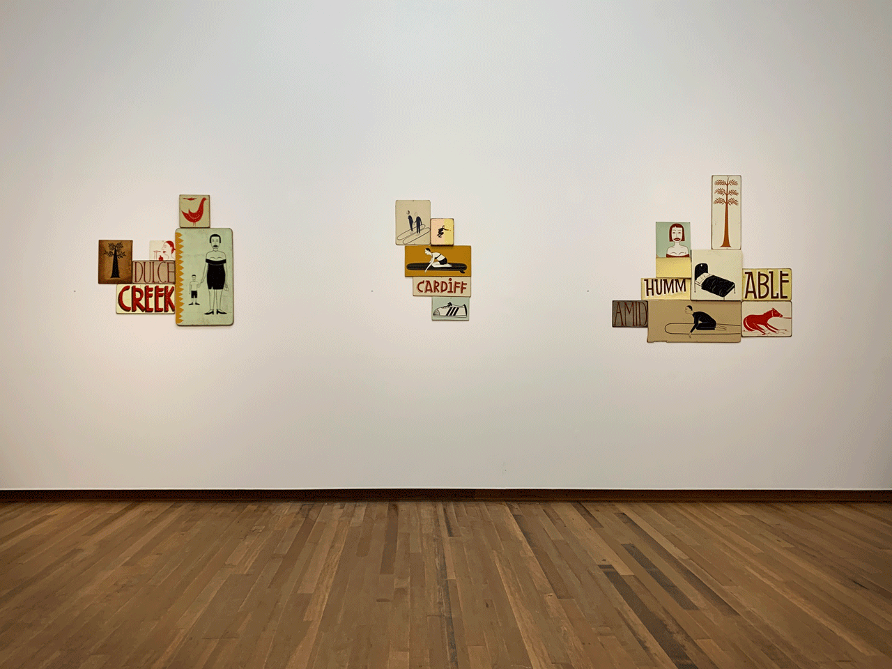
Surfing was a particular passion for Kilgallen and features extensively throughout the exhibition. ‘Cardiff‘, ‘Dulce‘ and ‘Linda Mar‘ refer to the names of beaches and the latter was her local surf spot which sits just below the hills where she married McGee; the exhibition includes a monochrome painting which was used for their wedding invitations showing them riding a longboard together. These names have been clustered together with images ranging from a bedridden man and an obstinate horse to a soignée mother and the Adidas Superstars that Kilgallen habitually wore. The interplay of these pictures and words creates an infinite number of stories within the viewer’s mind; as she herself states “My work is narrative, but it doesn’t have a definitive narrative”.
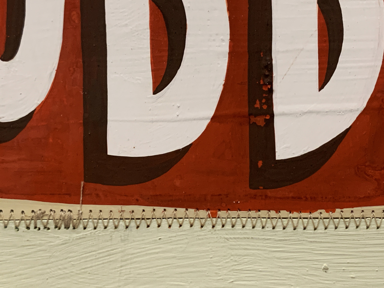
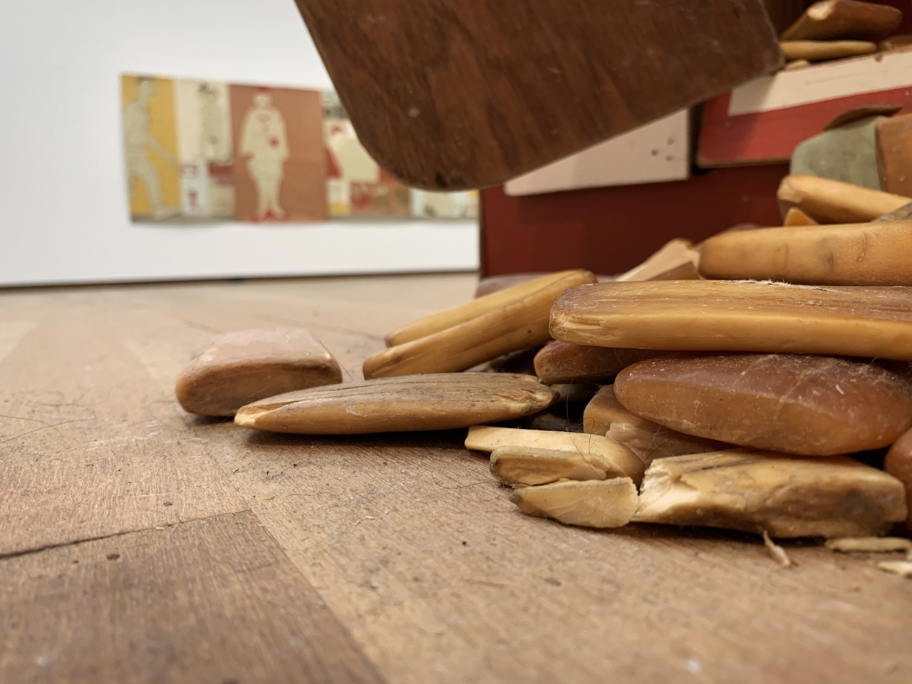
The exhibition’s title is derived from a quote from an Art:21 documentary given as she was preparing her first institutional solo show at the Hammer Museum in 2000: “I spend a lot of time going over the line and over the line and trying to make it straight. I’ll never be able to make it straight. From a distance that might look straight, but when you get close up, you can only see the line waver. And I think that’s where the beauty is.” Indeed, her love of uniqueness, imperfection and transience extended to sandpapering over her works to accentuate the wabi-sabi aesthetic. A young Kilgallen spent family summers in Western Maryland which imbued her with a deep appreciation for Amish craftsmanship and the self-reliance that comes with those skills. This is evident throughout her work, as is her interest in Indian art which manifests through a consciously flat application of paint and the use of soft green and bright red house paint reclaimed from the ‘oops’ pile of her local Kelly-Moore store.
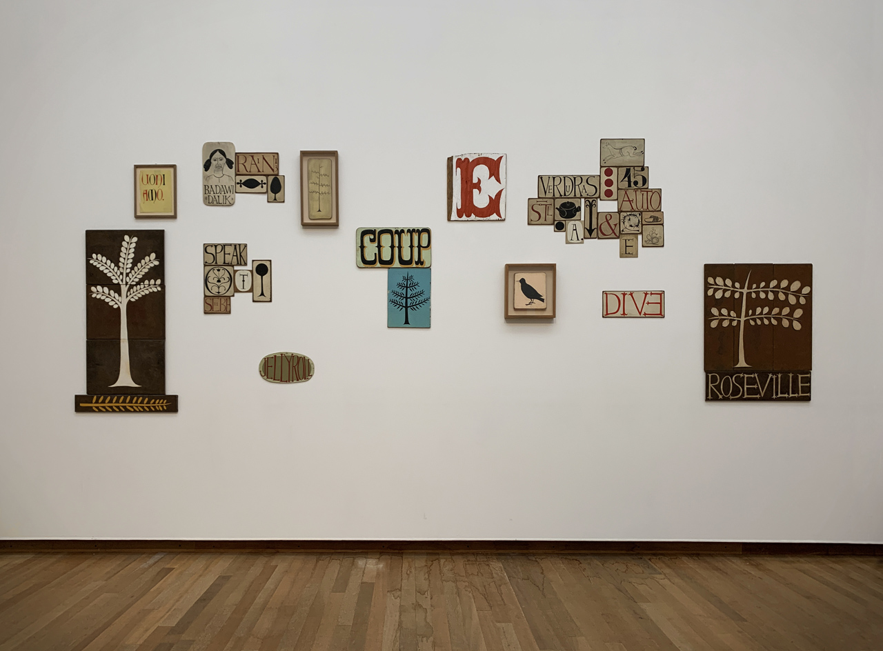
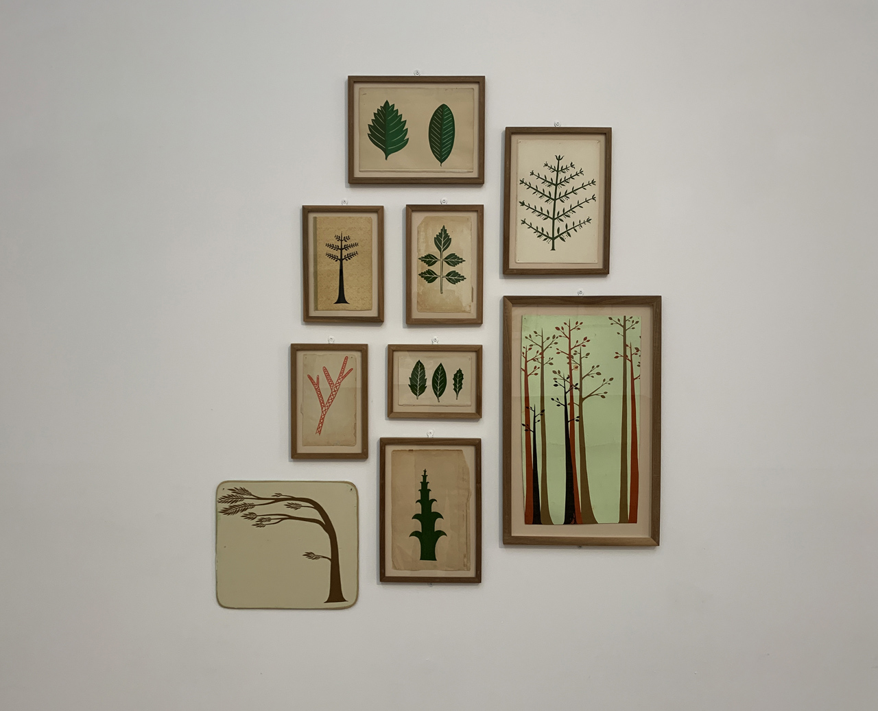
Kilgallen received a BFA in printmaking from Colorado College and her work took on the economy and elegance of Ukiyo-e printmaking which she encountered during her studies. Her printing credentials were furthered by a two-year letterpress internship which she started when she first moved to the Bay Area in 1989, so it was a natural progression within her practice when she produced a series of aquatint prints at Paulson Press which have been brought together for this exhibition. However, it was her next job working as a ‘page’ restoring and repairing books under the tutelage of Dan Flanagan at the San Francisco Public Library which helped to shape her work to an even greater extent: images are painted on the end sheets of books removed and rejected during the preservation process; paintings have been stitched together like the spine of a book; early letterforms have been influenced by the typography encountered in the 16th century botany reference books she regularly worked on. Indeed, this lettering even influenced her paintings of trees which all possess distinctly serif-like bases to their trunks. The tree paintings are some of the most numerous in the exhibition and they reflect both her background and her general disposition; as Kilgallen noted “I was a nature kid…I used to just sit in the treehouse for hours”.
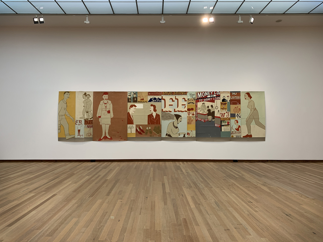
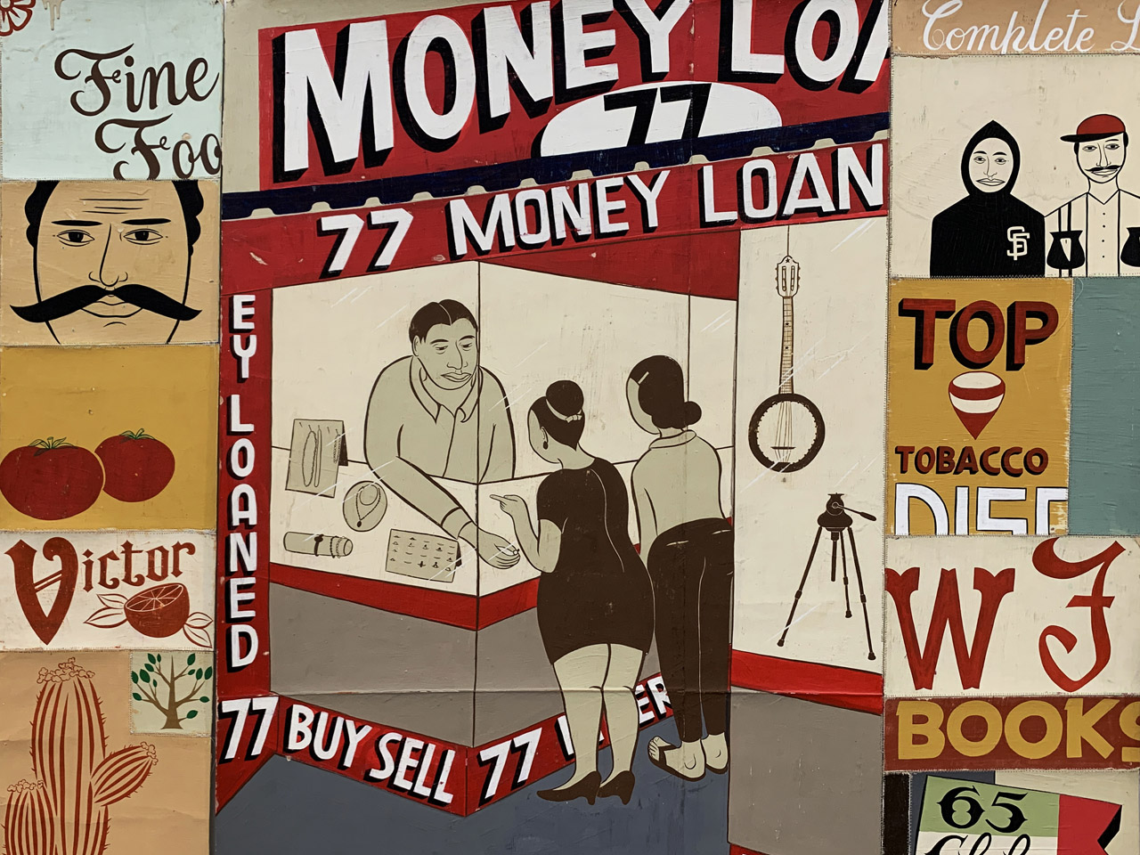
The exhibition reaches its crescendo with three monumental works in the final room. Adjacent to a 26’ long unstretched canvas which now resides in the permanent collection of the San Francisco Museum of Modern Art, hangs ‘Money to Loan‘ which combines typographic, figurative and decorative elements to create a folkloric urban landscape. In many ways, it is a love letter to the hand painted signs around the Mission District with multiple references to the neighbourhood’s Chicana heritage and a pawnbrokers which at the time was located on 6th Street. “I like things that are handmade,” the artist explains in respect of the storefront lettering ‘in that they did it themselves. That’s what I find beautiful’.
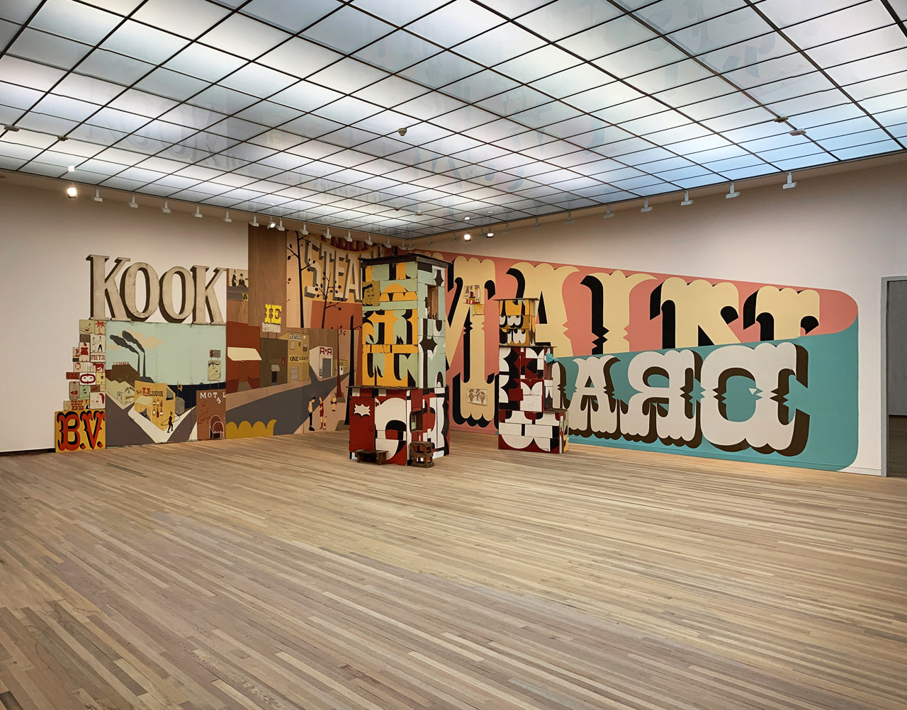
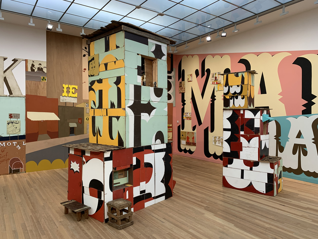
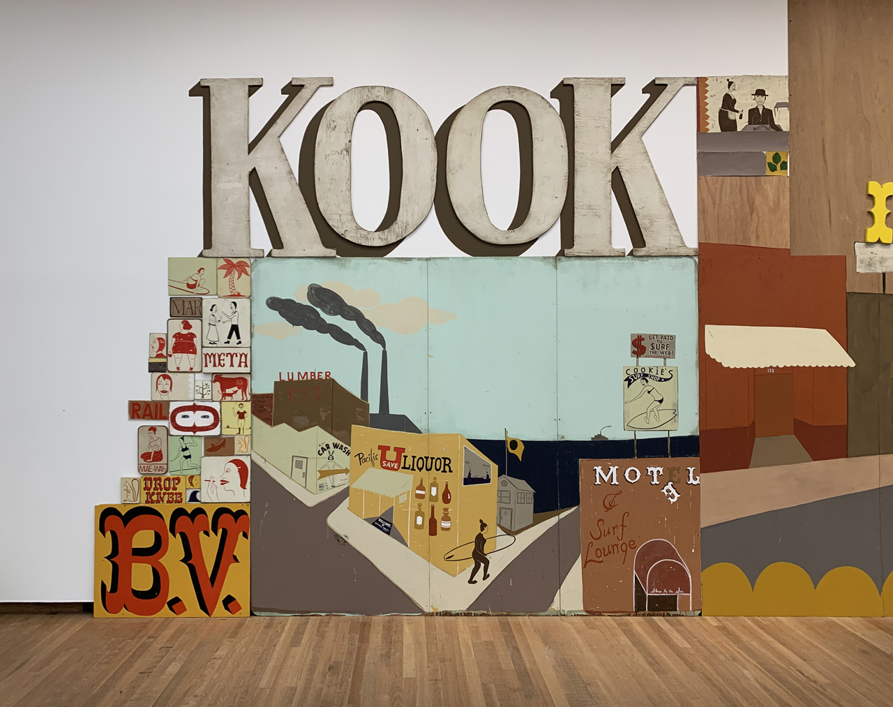
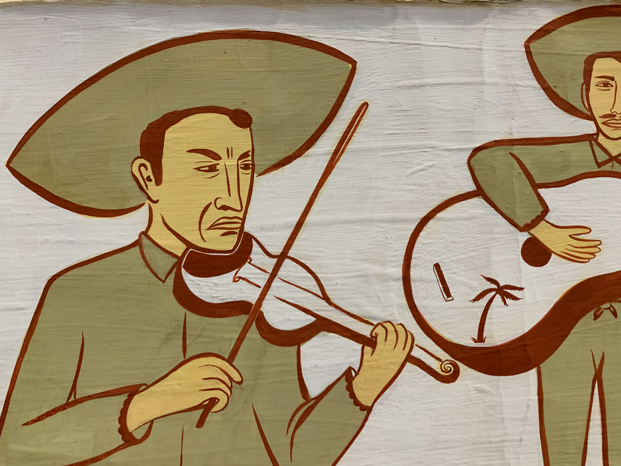
Main Drag, which was originally shown at the Institute of Contemporary Art in Philadelphia, was Kilgallen’s most ambitious work both in terms of its physical scale and its wide-ranging, cinematic narrative. The huge patchwork of storefronts, portraits and letterforms alludes to southern California’s coastal towns and the community to which they’re home. The work is a testament to the Amish resourcefulness that she so admired, both in the sense that many of the raw materials used were scavenged and because painted elements from her previous two shows at Deitch Projects and the Hammer Museum have been repurposes and incorporated into the new installation. The towers were inspired by shacks made from billboards she encountered in Baja California and the bars of soap tumbling out of them are reminiscent of the ex-voto in the Igreja Nossa Senhor Do Bonfim church in Brazil which she visited with McGee in 1994. Modest gems can be found nestled throughout the work’s overall ecosystem: a surfer heads to the beach down a street which exists both in and out of time; the demeanour of a mariachi violinist has been executed with a disarming economy of line; the letters B.V. in the bottom left have been rendered in a characterful carnival script and reference one of her husband’s occasionally used monikers – Bernon Vernon.
In the artist’s statement from her first solo show in 1997, Kilgallen said “I am interested in things made by the human hand”. This exhibition is a celebration of the imperfections created by the human hand and the beauty which that reveals about ourselves.
Photo credit: feralthings


Michael tuttle says: